There’s a little conference called SIGGRAPH next week. But, there’s more to life than that. One thing I like about small, focused symposia is that they’re just that, small and focused. If you go to one in a subject you’re into, everyone there is someone you want to talk with, vs. the vast crowds of “what do all these people do?” at SIGGRAPH (though that can be fun, too. My advice is to say hello to whoever’s in a long line with you).
It’s a little hard to find a solid list of these smaller symposia, though WikiCFP is not bad. However, it includes symposia I’ve never heard of. More important, it’s missing HPG 2026 and HPG 2025, though does have HPG 2024. Pro tip: note the conferences are listed by CFP dates, ascending, and then descending order for expired CFPs, which you can use to at least get some sense of when next year’s CFP might be. If anyone knows a better resource, please let me know!
One pair of back-to-back symposia coming up next year, both in Kortrjik, Belgium, and relevant to real-time rendering people, are also not listed. This might be because these are more informal – the call for participation asks for talk proposals, by practitioners, vs. research papers. Both are organized by The Khronos Group:
Vulkanised 2027, focused on developers using the Vulkan API, February 8-10, 2027. Khronos Vulkan-related (and other) sessions at SIGGRAPH here.
With SIGGRAPH and friends (HPG, DigiPro, ASWF) coming up in a week, here are some graphics-ish sites that you can waste time with while traveling.
1. Make a word out of (mostly) nature photographs. Hover over each letter for where the image came from. The palette for many letters is a bit limited (2-3 choices), but I like the concept.
2. Wiki Spy. Start with a search term, or just start clicking. Each click gives you other related images on Wikipedia. Once you click you can go to the related page by “View on Wikipedia” in the upper right. Not graph-oriented enough? Use Six Degrees of Wikipedia to see how any two things are related.
6. Going to Silicon Valley afterwards to look for a job? Take the tour to check average salaries. I do like that it includes tiny animated cars, trains, and airplanes. Then, feel their pain and their dreams of a garage.
(Me, I think it should be “Sloppendium” so you don’t say “slope,” but so be it.)
Fredo Durand writes, “I wanted to see how far I could go in a month with the help of AI coding agents to write course notes / a web book for my computational photography class.
So, you’re saying, “why bother looking at that?” The main reason, for me, is: interactive figures! I missed the memo, but it turns out SVG figures now support interactivity. <– And that link is wimpy, mostly showing highlights when you mouse over or click something. It’s better than that…
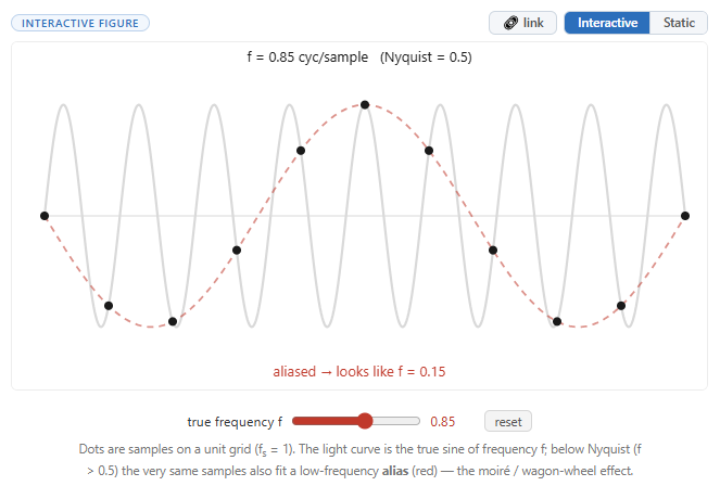
Go to the section on aliasing and check out the first figure. Slide the slider – ooo, high frequencies turning into lower ones, in a nutshell. This figure, and all the others, were generated by AI, with Fredo’s guidance.
The process of making an interactive illustration is imperfect. In this case, the original figure had a bug for some values on the slider, which Fredo then had to get the AI to correct. I’m sure there are plenty of other bugs throughout the book at this point. Fredo says it’s “very much in progress and I have more or less not read a word of it.” But, having an AI agent code up interactive SVG figures is way more efficient than learning a whole new language and dealing with all the fiddly bits.
The book is indeed incomplete, many sections TBD. It has layout problems and oddities, like some equations having unnecessary scroll bars. But, it’s an experiment, WIP, and it’s notes for a class – an effort that, if done by hand, would have easily taken a few authors a year or more. Perhaps consider it an exercise: maybe reward students with a candy for each bug found? Well, that’s a bad idea, I admit: a bunch of students then are learning the wrong material before it’s corrected. That said, I’ve heard of teachers having students use AI tools to help find and correct errors purposely put into some document or code. For this sort of book project, the fact-checking is probably the most time-intensive part.
To digress a bit, here’s a paragraph from an article in Wired about fact-checking that made me laugh: “Then there’s the models’ own assessments. When I asked ChatGPT how accurate the major LLMs are, it told me that most models had 90 to 96 percent accuracy on some professional-style tests. It then offered a link, confusingly, to a paper on a sleep medicine certification exam. On ‘general real-world questions,’ it simply offered me the rate at which models like it have been shown to hallucinate: 1 to 2 percent, apparently, though when I tried to click through to that referenced source, it didn’t exist.”
Back to the coolest part of Fredo’s experiment – the figures. The aliasing page has a few – scroll down. Or go here and play with shading models (this figure could use something to normalize the curves, but in a way, that’s the lesson). Or warp a mesh. Or check out caustics and chromatic aberration. Or look in other chapters – you’ll find them. Fredo notes, “It’s crazily easy to make demos. I was initially worried that figures were going to be a major issue but they turn out to be mostly easy and incredibly fun. I even have stable diffusion running in the browser.”
I know of only one other book related to computer graphics with interactive elements: Immersive Linear Algebra. It seems like there should be more, but I can also imagine how much effort it is, or was, to make such figures (I know my MOOC demos took me a good long while). Hopefully now with interactive SVG and AI agents, there will be.
Not interactive in this blog, sadly. Go here and you can slide the slider.