There was a bit of a stall with JCGT, the Journal of Computer Graphics Techniques, last year, to be honest. It’s a volunteer effort and Real-Life(tm) can get in the way. We’ve regrooved: I’m temporary Editor-in-Chief, Marc Olano is the Production Manager, we’ve recruited more editors, and we’re all caught up with the backlog, as of today. So far nine papers have been published this year. There are more submissions in the pipeline. Bottlenecks are quickly cleared. New features such as ORCID links for authors have been added. Come July, Alexander Wilkie will take over as Editor-in-Chief, after he’s done co-chairing EGSR 2025. Expect more useful additions to JCGT for authors and readers in the future.
I’ve been helping out in this way since November 2024. I’ve learned that the glamorous job of Editor-in-Chief is mostly cajoling, wheedling, coaxing, and begging the other volunteers – reviewers, editors, and authors – to help keep things moving. The major tool needed is a good reminder calendar of some sort. I use Remember The Milk. It’s also a great whipping boy, “my calendar reminds me that your review is due.” See, not my fault that I’m nagging you, it’s the calendar’s. I joke – most people are happy to help out and do so in a timely fashion, and a few are incredibly fast at responding.
Honestly, I’m thankful and impressed by the huge amounts of time and effort, freely offered, from hundreds of people in the computer graphics field over its 14-year history. Its focus on practical techniques is a niche rarely addressed by most conferences or journals. Thanks, all!
Now that we’re entering the summer conference season – I3D, EG, EGSR, HPG, DigiPro, SIGGRAPH, on and on – I’ll ask that you, yes, you, be on the lookout. Is there a cool paper you saw, or person you talked with, that had a useful technique which deserves more attention on its own? Please suggest that they consider submitting their idea to JCGT.
JCGT is run on a shoestring. Our one paid position is copy editor, the wonderful Charlotte Byrnes. This minimal structure, without any serious economic constraints or influences, lets us do what we want to do: offer peer-reviewed articles and code with “Diamond Open Access,” i.e., free to readers and authors. Better still, authors retain copyright on their articles, with a Creative Commons license allowing us to distribute them. This is rare in the publishing world; even non-profits normally own the copyright, often as a revenue source.
JCGT also has an informal arrangement with I3D. Since 2016, authors of JCGT articles accepted in the last year are offered the opportunity to present their work at I3D. For example, you’ll see four JCGT papers in I3D’s program this year. I3D 2025 has just happened, but the recordings should be up soon. Enjoy!
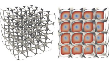
Below’s a teaser image from an article just published today – visit JCGT to see more.