[TL;DR? Go try the puzzle instead.]
A few questions came out of my blog entry on GPUs preferring premultiplication from various people, including myself. Let’s nail them down one by one, then add these bits up to explain why PNG is not very good at storing antialiased cutout and decal images (images which have an alpha component) that were generated using physically-based rendering. It turns out it’s not PNG’s fault, it’s the implementation used by PNG viewers. I provide two downloadable PNG images to test your own viewer or renderer to determine whether sRGB and compositing are working properly.
If you’re already convinced that you should do filtering (and most every other computation) in linear space, skip the first section. If you already know that you should think of linear values for a pixel as intrinsically premultiplied, since they represent radiance for the pixel, skip two sections. If you know that viewers and browsers don’t blend PNGs with alphas properly, skip to the conclusions at the very end and see if you agree. Me, I’m still learning, so can imagine I made a goof along the way (update: and indeed I did!), though I’ve tried very hard not to do so. I’m honestly surprised how many viewers and browsers (perhaps all?) don’t perform display, filtering, and compositing correctly for this image type.
Don’t Filter in sRGB
This should be one of those things everyone knows by now, but just in case…
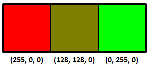
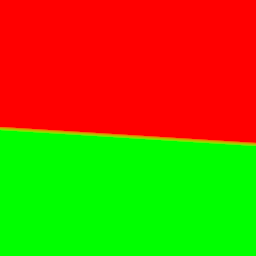
So you have three texels and two colors you’ve stored in a PNG, red and green:
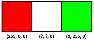
Interpolating between these two colors equally, what’s the color (that you store in the PNG) of the center texel? The answer is not (128, 128, 0), the average of the two texels on the ends. You can sort-of tell by just looking at the result:
The right answer is:
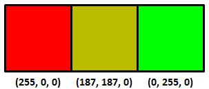
You shouldn’t interpolate or otherwise filter when in sRGB (essentially, gamma corrected) space, that’s why it looks bad. You shouldn’t do this because sRGB is non-linear – linear operations such as addition and multiplication don’t work properly. Update: see this link, for example – the bus license plate is a good example.
Instead you want to convert from sRGB to linear space, interpolate in linear space, and then convert back to sRGB (equations here). It’s also what you want to do to get good mipmaps, or anything else where you’re using multiple samples to get a new value. My favorite article on this is Larry Gritz’s from GPU Gems 3. There’s also a nice recent article about this workflow on the Renderman Community site, showing how to convert textures to linear space, do lighting there, then convert back for display. If these articles don’t convince you that linearization is necessary, I’m not sure what would.
Here’s another example, sRGB interpolation vs. the correct linear interpolation over a band of about 4 texels in width:
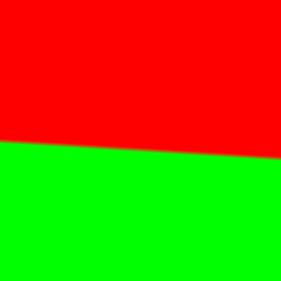
The sRGB interpolation gives a black band, the correct linear interpolation gives a smooth transition (personally I see a more yellowish transition, which makes sense since it’s over a few pixels, but the general brightness is the thing to notice the most here; if you back up a bit the yellow goes away but the black band in the first image is still there. On a phone you may have to zoom in).
Premultiply before converting to sRGB
Say you’re computing the coverage of a triangle you’re rendering, in linear space. It covers half the area of some pixel, alpha = 0.5. You compute the color of the triangle covering half this pixel, and the color is (1.0, 0.0, 0.0). I’m going to use floating point triplets here for colors in linear space; sRGB maps these values to displayable values we store in, say, a PNG image file.
Normally you take your color, clamp or otherwise map each of the RGB values to [0.0, 1.0] (possibly using tone mapping), and then convert to sRGB for display and storage. The question is: do you first premultiply your color by alpha, then convert to sRGB, or vice versa?
It’s clear you don’t modify the alpha coverage itself by sRGB. Coverage is coverage, it remains the same in any color space. What coverage represents is how much of a surface is visible in a pixel. If you think about it, our half-covered pixel with a (1.0, 0.0, 0.0) surface color on the triangle should emit the same amount of radiance as a fully-covered pixel that has a surface color of (0.5, 0.0, 0.0). The only way to get these to be equivalent is to multiply by the alpha first, then convert the resulting color to sRGB. As Larry Gritz succinctly put it, “radiance is associated,” that is, the area of the emitter in the pixel matters. The radiance is computed by including the area coverage term in the computations.
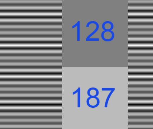
So, the order is linear space -> premultiply the result to get the radiance -> convert this radiance to sRGB. Take our triangle’s color of (1.0, 0.0, 0.0) and alpha of 0.5, we get an RGBA result of (0.5, 0.0, 0.0, 0.5), our radiance values with an associated alpha.
To display this antialiased result on the screen we convert to sRGB space (or gamma space, if you’re a bit sloppy about it). Of course, our screen itself doesn’t store an alpha, we can’t see through the screen, so we normally think of such a result as being composited against a black background. Using sRGB conversion, we get (0.7366, 0.0, 0.0). Multiply by 255 for an 8-bit display and the displayed value is then (187,0,0).
PNG cannot store all clamped linear values…
I would be a terrible mystery writer, as my chapters would all have titles giving away what happens in the chapter. However, since I’m getting paid by the word (ha, joke), I’m going to walk through each step carefully and slowly, building the suspense (or boring you half to death).
Here’s the strange bit: you can’t store a number of seemingly valid RGBA values in a PNG for some combinations, when fractional alphas are involved.
Update: the following logic is wrong, but it’s what would be needed for your browser to work correctly. Skip to the next “Update:” if you want to skip past this erroneous, but still interesting, information.
To store this sRGB value in a PNG we need to “unassociate” or “un-premultiply” the RGBA value. In other words:
Unassociated RGB = Associated RGB / alpha
We then multiply the resulting RGBA floating point values by 255 to get values we can store in a PNG.
Just to be clear, alpha itself is unchanged for unassociated and associated colors, it’s just the RGBs that can differ. If alpha is 1.0, the unassociated RGB value is identical to the associated one. If alpha is 0.0, we don’t divide; we assume the RGB is (0.0, 0.0, 0.0), since the result has no area, and so, no radiance. It’s only the fractional alphas where the unassociated and associated values differ.
Take our RGBA value of (0.5, 0.0, 0.0, 0.5) from above.
We converted the color to sRGB, the four values were then (0.7353, 0.0, 0.0, 0.5).
Now convert by unmultiplying (a.k.a. dividing) the RGB value by the alpha value, to get the unassociated values that PNG so craves. That is, divide by the alpha of 0.5; in other words, multiply by 2.0. We get (1.4707, 0.0, 0.0, 0.5).
Multiply all four values by 255 to get 8-bit values that we can store. Just to show we haven’t converted to PNG’s unassociated format yet, let’s leave these as precise floating point values: (375.0, 0.0, 0.0, 127.5). Rounding, that gives us (375, 0, 0, 128).
If we could store premultiplied (associated) values, we could simply store (0.7353, 0.0, 0.0, 0.5) times 255, which is (187, 0, 0, 128), knowing that when we’d convert back to linear space someday the values would go back to about (0.5, 0.0, 0.0, 0.5).
To sum up:
(0.5, 0.0, 0.0, 0.5) the premultiplied result in linear space
(0.7353, 0.0, 0.0, 0.5) converted to sRGB
(1.4707, 0.0, 0.0, 0.5) RGB divided by the alpha of 0.5 to unassociate the alpha
(375, 0, 0, 128) multiplied by 255 and round
And that’s the punchline: this value cannot be stored in a PNG properly, since the maximum value in a PNG is 255 and PNG is always unassociated. The best we could do is store (255, 0, 0, 128). But if we then convert this back from sRGB to linear space, we don’t get anything near the original (0.5, 0.0, 0.0, 0.5) result:
(255, 0, 0, 128) stored in PNG
(128, 0, 0, 128) associating (multiplying by) the alpha/255
(0.216, 0.0, 0.0, 0.5) converting from sRGB to linear space
The answer should be (0.5, 0.0, 0.0, 0.5), but the clamping has dimmed the color value down massively. So instead of being able to store a linearized color value of 0.5 when alpha is 0.5, the best we can do is store one that is 0.216. Another way to say this is that our triangle can be no brighter than twice this value, (0.432, 0.0, 0.0), before premultiplication, instead of (1.0, 0.0, 0.0) – quite a drop on the linear side of things.
I don’t know about you, but I found this surprising, that PNG is actually incapable of storing antialiased cutout images computed by a normal renderer working in linearized space.
The complaint is often leveled at storing 8 bit pre-multiplied colors and alphas is that you lose precision: a gray level of 255 and of 128 will both be represented by a 1 if the alpha itself is 1. The flip side is that, for colors that have perfectly valid colors and alpha when premultiplied and converted to sRGB, unassociated storage as used in a normal PNG cannot properly save these RGBA values. PNG sadly does not have a premultiplied mode for storage, so is stuck; if it had such a mode it could properly store (187, 0, 0, 128) and so properly display (187, 0, 0) on the screen.
If you don’t believe this result, that there’s some misstep, solve this puzzle instead.
Update: in fact, there is a problem! It turns out that PNG says that you need to unmultiply before converting to sRGB. This goes against theory, in that you normally take a premultiplied result and convert that to sRGB for display (composited against a black background). But it turns out that the proper sequence for PNG conversion is to un-premultiply and then convert to sRGB. So the right answer is to store (255, 0, 0, 128). You convert this to linear space, (1.0, 0.0, 0.0), multiply by alpha (0.5, 0.0, 0.0), convert back to sRGB space (187,0,0) and display the result. It’s just that simple. Which is why premultiplication is nicer: none of these conversions is necessary, you’d just ignore the alpha and display the RGB stored, if PNG could store premultiplied values.
See the puzzle for more information, and my thanks to friedlinguini for finding the right passage in the spec. I’m happy to see PNG itself is not broken! Based on this new information, let’s see how viewers and browsers view such PNGs with alphas.
Let’s let our viewers at home decide…
Do image manipulation programs, viewers, and browsers implement PNG with alpha correctly? Let’s go grayscale and find out… (hint: the answer’s a pretty resounding “no” – if you find a package that does it right, let me know).
One question is whether PNGs are sRGB by default, or linear by default; that is, if the gamma or sRGB chunks are missing, what’s expected? I poked around through specs, but don’t see a definitive answer, and frankly in my experience 99.98% of all PNGs I see without tags are in sRGB – they’re meant for display.
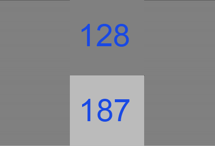
But, let’s test. Here are two sample images in PNG:

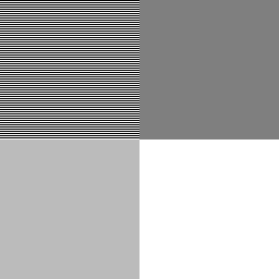
They (probably) look identical on your display: two grayish squares on the left, a dark gray square upper right, and white square lower right. I checked: it won’t work on the iPhone 6 or Samsung Galaxy S3, as you can’t display this image at its native resolution. These devices perform cheap and incorrect filtering on the image (they filter in sRGB space; more on that below).
Both images have the same data:
The upper left square in each has alternating lines of full white and full black. Blur your eyes and you get a half-gray. The sRGB nature of this gray is shown by how the bottom left matches the top left (on sRGB monitors) when you blur your eyes, a basic gamma test. This shows that both PNGs are treated as storing non-linear sRGB values, as the 187 gray value is the sRGB equivalent of half-gray in linear space, as we’ve seen. There is a gamma chunk in PNG, but it’s rarely used.
The only difference between the two images is that the one on the left does not have gamma or sRGB PNG chunks (generated using LodePNG), the one on the right has both (it was generated by reading the one on the left into paint.net and then writing it out; you can review the chunks using pngcheck in verbose mode). They display identically, so the browser is clearly assuming that if these two chunks are missing, the PNG should be interpreted by default as storing sRGB values. This is indeed the norm: PNGs are usually used for lossless display of images, so the color values naturally are sRGB values that are directly copied to the display. However, this means that the “you could set the gamma to 1.0” option in PNG is extremely unlikely to be honored by most tools. Also, even if possible, storing 8-bit values in linear space can give a banded look when converted to sRGB. PNG does support 16-bit storage, which would solve any banding from using a gamma of 1.0.
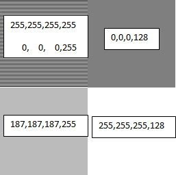
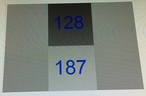
Display this image in, say, IrfanView, which composites against a black background for display, and you get this:
Note that the lower right corner is a 128-gray.
If you want to see the test image composited in your browser against a black, white, and gray background in turn, see this page.
Most (all?) browsers and viewers are a bit broken
Now we know PNGs are treated as if they’re in sRGB space by default. However, it turns out most browsers and viewers do not properly interpret or blend PNG colors when alphas are present, or even when they’re not! Here’s the proof.
The two squares on the right each have an alpha of 0.5. The upper square is black, the lower is white. Browsers composite these images against their background color. If the background color is white (as it is on this page), then the upper right square should composite to be half-black, half-white. With a value of (0,0,0,128), it’s saying that the surface is covered with a black color that is half-transparent, so that the white background should contribute only half its emission. If the math is done properly – sRGB to linear, perform blending, then linear to sRGB – then the resulting color should be around (187,187,187) and so match the results on the left. It clearly doesn’t; the browser is simply blending the two colors directly in sRGB space, without any linearization, giving a darker gray than should be displayed.
If instead you display these images composited against black, as happens in the popular IrfanView viewer, you get a darker gray for the lower-right square, when again you should get a 187-level gray, as shown above. So, IrfanView (and other viewers I tested) also do not perform linearization when blending.
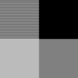
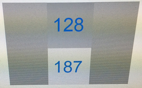
You can tell that blending is also done improperly even when no alphas are present, by using the “resize” function. Resize the test image to 50% of its original size, i.e., make it 128×128. Use the best filter available (e.g., Lanczos).
Here’s the result for XnView, for example (I had problems getting IrfanView to properly save the alpha channel):
It’s wrong, it’s not blending in linear space. You can tell because the alternating lines in the upper left are now a 128-level gray instead of the proper 187. The gray in the upper left is significantly darker than a scaled down version of the original image. If you have an image manipulation program that gives the right answer, let me know. Imagine this is the next level up in a mip-map pyramid and you can see why the norm in interactive 3D graphics is to perform linearization before filtering, and why there’s GPU support for it. Pity we can’t get the 2D guys to adopt the correct algorithms.
Here’s the original image, again, but made smaller (128×128) by your browser by adjusting the HTML image display width and height:
I’m betting dollars to donuts you see the wrong result, similar to XnView’s (and every other free image manipulation package I tried). The image is shrunk to half size and so the alternating lines of white and black are incorrectly blurred to a 128-gray.
By the way, the reason the original image alternates lines of white and black, instead of using a white and black checkerboard, is to avoid any level response problem the display might have. This used to be a problem with CRTs, I don’t know if it is with LCDs, but let’s leave it out of the equation.
Right-click on the two test images and save them if you want to experiment; attach as a surface texture to see if you are performing compositing correctly. If neither of the squares on the right looks very close to the matching grays on the left, the software is not performing alpha blending properly. It should premultiply (every viewer and browser does this correctly for PNG conversion), linearize each value, blend with the linearized background value, then convert back to sRGB for display. Instead, most software simply blends in sRGB space, which is wrong.
If the two squares on the left don’t more-or-less match (blur your eyes), then you’re on an ancient Mac, NexT, SGI, or something else that’s non-sRGB. More likely, you’re on a smartphone or other device that is not showing the test image at one pixel per texel. Its faulty filtering makes the alternating black and white lines average to a gray level of 128 at the limit, when it should be 187.
I suspect the reasons most viewers and all browsers I tried are broken in this way is expediency (all that conversion per pixel is expensive, and fractional alphas in PNGs are rare) and lack of understanding, plus possibly legacy users expecting old behaviors. I certainly didn’t fully understand how to interpret PNG data when I started this post, and have had to revise it!
Now I see why OpenEXR, a floating point format with alpha and that saves premultiplied colors, is preferred by film companies and other industries where proper compositing is critical. Simple to display, and premultiplication makes display and compositing much less costly.
Conclusions
- Perform interpolation, blending, mipmapping, or other filtering in linear space, not sRGB.
- In this linear space, if your computations produce a fractional alpha, make sure the color is premultiplied by this alpha somewhere along the line before converting to sRGB. Update: unless you’re converting to PNG, in which case you want to unmultiply your RGBA before converting to their quasi-sRGB space.
- Update: wrong.
If you have fractional alphas and you want to store these along with the colors, for later use when compositing, you may get values too high to store in your PNG after unassociating the alpha from the color. Cutouts without partial alphas, or with dim colors, may be storable.
- Don’t expect PNG alphas to be used properly for viewing on most viewers or on web browsers. This is not PNG’s fault per se, it’s the browser/viewer’s for not using linearization when compositing.
- Test and find out. The PNG test image can help you see what an application does with the data.


