So, I don’t think my work on Real-Time Rendering, 4th Edition will ever be done, even though the thing’s published…
First, yes, we also were unhappy with how some of the images printed in the first printing of the book. And yes, I’m happy to report the second printing is better quality; we wish the first had been, as well, and we are all sorry it wasn’t. The main sources of problems are atoms and the process. There’s a limit to how thick a book can be and not have its spine break, or be readable without crushing your chest. The publisher pushed up the thickness on the second printing, which improved the readability of some figures (I’m ordering one now, after having seen it, so I can compare). Fingers crossed that the binding holds up. It’s why we published two chapters and two appendices online – a 1350+ page book is basically unprintable, let alone readable.
All diagrams and some of the images (those we have rights or permission for) are available for viewing and download on our website, about 2/3rds in total, and I added more today. If we are missing any that would help you understand the text better, please let me know and I’ll see if I can clear rights for them to be redisplayed there – my email’s on the website at the bottom. As important, we hope to provide slightly-improved images to the publisher for the far-distant day when a third printing might be made.
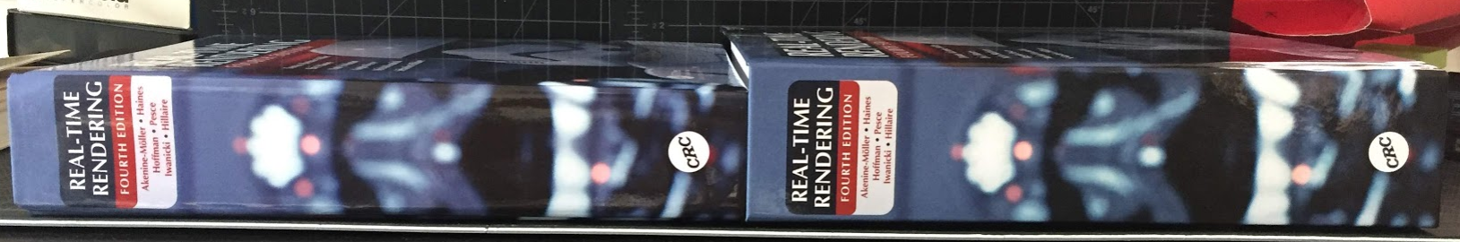
Which edition do you have? I think you can tell by thickness, with first printing being about 4.8 cm (1-7/8″) thick overall, and second printing being around 5.4 cm (2-1/8″), maybe more.
I was interested to read that Matt Pharr had the same problems with the latest edition of “Physically-Based Rendering.” He writes:
It was a terrible feeling, having put endless hours into the book, putting in all of our own best efforts to make the very best thing we could, and then having something awful being put in readers’ hands. We had no control of all sorts of details beyond the text itself
Yup, I can relate. The last thing we see is the print-ready PDF, and after that it’s hope for the best. At least no sections of the book were deleted, duplicated, printed upside-down, or in inverse colors.
I see about 18 out of 676 figures that are noisier or darker or have less contrast than I would like. I am interested in which figures you find difficult to understand. Personally, I’ve love it if the electronic version and paper version were “bound together” and always came as a set – the electronic version, though not as high-resolution as I’d like (unsurprisingly, Amazon didn’t want to provide the 2.2 GB PDF that we get when we compile the book ourselves), does have more readable figures.
My personal take-aways are two: don’t try to print images showing noise, they’ll just about never print well, and don’t try to print images that are somewhat dark, they’ll always seem to get darker when printed. The first is a new lesson learned, the second is one I’ve seen in previous editions but always hold out the hope that it’ll be better this time around.